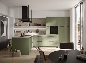
Why Choose a Colorful Kitchen? The Benefits of Using Color in the Kitchen
Today, a kitchen is much more than just a place to cook—it’s a gathering spot, living space, and comfort zone all in one. And that’s exactly why it’s worth focusing not only on function but also on atmosphere when designing it. A colorful kitchen brings life into your home—and you can feel it right away.
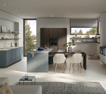
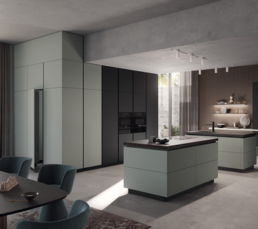
Colors create mood and character. Bright shades like yellow or mint feel friendly and energizing, while muted blues or greens radiate calm and elegance. So, by choosing a colorful design for your kitchen, you can consciously influence how the space feels—from invigorating to cozy. This automatically makes cooking, eating, and spending time together a more enjoyable experience.
Colorful kitchen cabinet fronts are more than just a visual highlight. Modern materials and finishes make them particularly easy to clean and durable—ideal for everyday use. At the same time, colors can be used strategically to highlight specific functional areas, emphasize cabinets, or make small spaces appear more spacious. Especially in open-concept kitchen-living rooms, colorful kitchens act as a design bridge between the living and cooking areas.
Color can also be used to specifically influence the sense of space. Light shades make small kitchens appear more spacious, while dark colors create depth and coziness—ideal if you want to design your kitchen to be both colorful and inviting. By the way, you can find more tips on this in our blog post about the Cozy Kitchen—a perfect complement if you want to design your kitchen to be not only colorful but also inviting.
In short: A colorful kitchen isn’t just a trend—it’s a statement—for more personality, a zest for life, and a home that truly feels like your own.

The Best Kitchen Colors: From Soft Tones to Bold Accents
Whether it’s warm apricot, elegant midnight blue, or delicate sage green—colors have the power to completely transform a kitchen. If you want to add color to your kitchen, you have more options today than ever before. The trick is finding the right shade for your space and style—and that’s exactly where the following kitchen color ideas come in.
Pastel shades for a light, charming look
Soft colors like rosé, mint, or sky blue are especially popular when you want to give your kitchen a friendly, airy feel. They pair beautifully with light-colored woods or white countertops and can be combined in many different ways—perfect for smaller spaces or open-concept kitchens that blend harmoniously into the living area.
Vibrant colors as stylish accents
If you want to be more daring with your design, go for bold hues like mustard yellow, burgundy, or pine green. These colors add depth and character to the kitchen. They’re particularly effective when used on a single cabinet front or kitchen island—this creates a multicolored kitchen without looking cluttered. They’re also ideal for design-conscious people who want to make a real statement.
Natural and earthy tones for a sense of calm and warmth
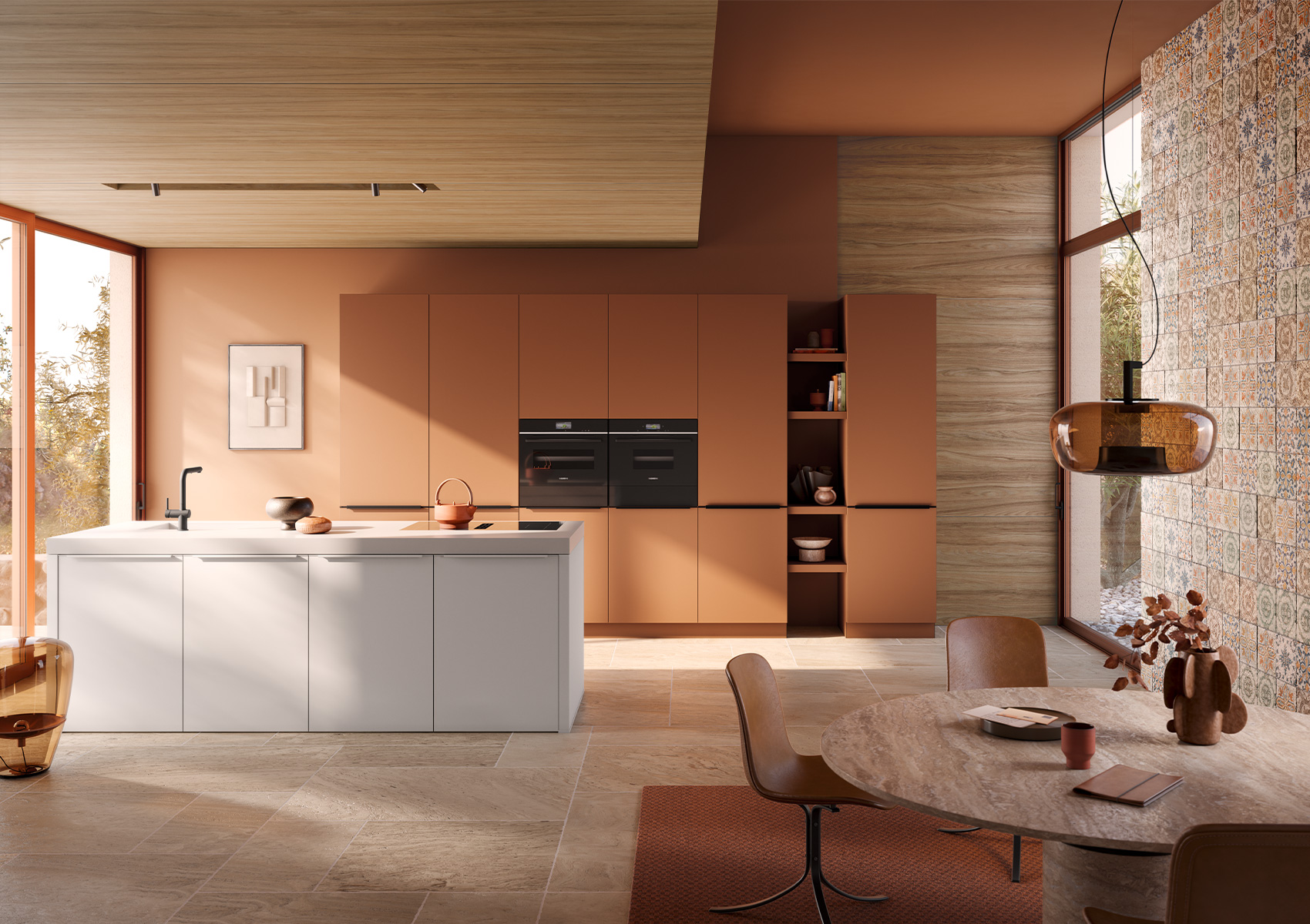
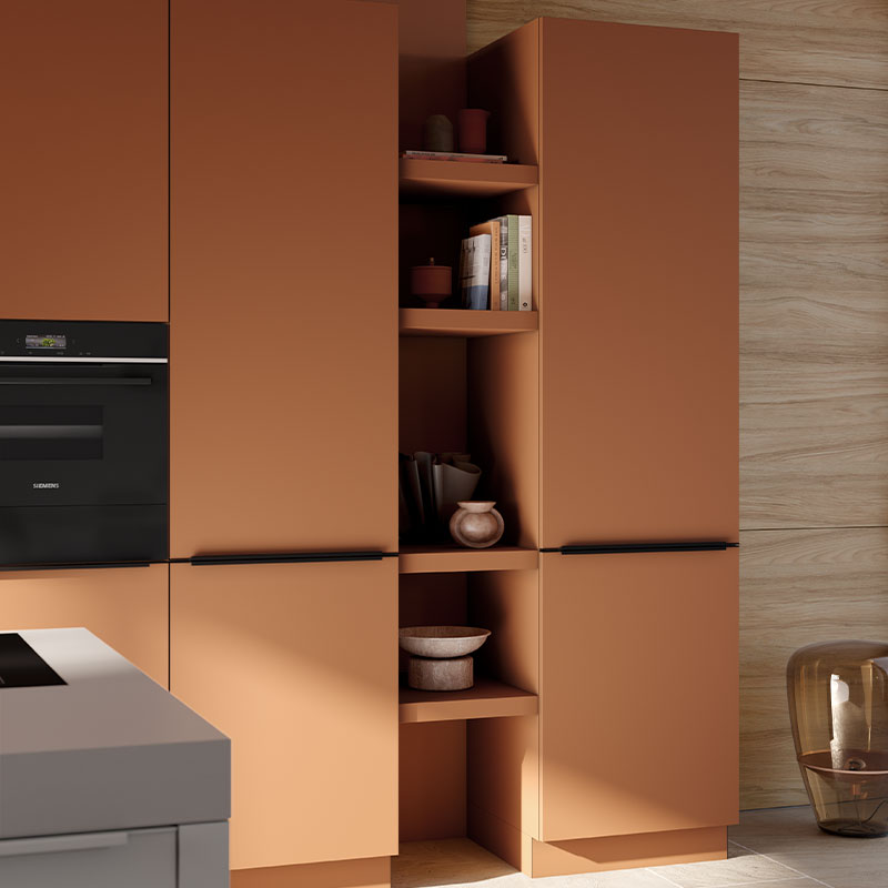
Shades of beige, terracotta, or olive green are not only timeless but also bring a pleasant sense of calm to the kitchen. When combined with stone or wood finishes, they create a cozy overall look that feels both modern and inviting—an ideal foundation if you want to design your kitchen to be colorful yet understated.
How do you find the right color?
Lighting conditions, room size, and usage patterns play a major role in color selection. Small kitchens benefit from light colors, as they make the space appear larger. Darker shades look particularly elegant in well-lit rooms. And: If you spend a lot of time in the kitchen, you should opt for colors that you’ll enjoy over the long term and that create a pleasant atmosphere—so it’s best to pay extra attention to how the colors work together. Taking a look at current trends can also be helpful when choosing colors for the kitchen—if you opt for timeless options, you’ll continue to enjoy the color you’ve chosen for decades to come.
Combining Colors—With System and Intuition
Designing a colorful kitchen doesn’t mean dipping it into a paint bucket. Often, a carefully chosen combination—or a color palette of two to three shades—is all it takes—for example, cabinet fronts in dusty pink with open shelves in walnut and gold accents. It’s important that the colors harmonize with each other and complement the kitchen’s style. Inspiration comes from the nearly unlimited spectrum of NCS colors offered by the kitchen manufacturer—from classic to unconventional, always precisely tailored to your vision. Equally effective is the combination of colored cabinet fronts with different textures and materials, such as tiles, stone, or wood-look finishes. Matte lacquered surfaces meet textured wood-effect finishes, while glossy elements add strategic highlights—creating depth, visual interest, and a high-end look that makes the kitchen truly one-of-a-kind.
Whether understated or bold: The world of kitchen colors is vast—and offers you the chance to design your very own dream kitchen.
Cleverly Combining Colored Kitchen Cabinet Doors—Here’s How to Make Your Kitchen One-of-a-Kind
Imagine walking into your kitchen in the morning—and being immediately greeted by a soft shade of rose on the wall, flanked by base cabinets in a rich petrol blue and open shelves in warm wood. The air is filled with the aKORFU of fresh coffee, and as daylight falls on the matte-finished cabinet fronts, it becomes clear: This kitchen is more than just a place to cook—it’s an expression of your style, your mood, and your outlook on life.
Kitchen cabinet fronts—the heart of every colorful kitchen
Colored kitchen cabinet fronts are the first thing that catches your eye in the kitchen. They set the tone—whether playful, elegant, natural, or modern. A bold mustard yellow on the kitchen island brings warmth to minimalist spaces. A delicate sage green creates a calming effect in an open-concept kitchen with plenty of natural light. Deep midnight blue exudes elegance when paired with gold handles and a marble countertop.
In short: If you want to add color to your kitchen, start with the cabinet fronts—they cover the largest surface area and thus have the greatest impact.
Combining Colors Wisely—Harmony Instead of Chaos
Even though the range of colors available for kitchens is vast, you need a sense of balance. Imagine a set of sand-colored base cabinets paired with upper cabinets in a soft sky blue. Or an olive-green kitchen island framed by wall panels with a light wood finish. The combination has a calming effect—almost like a stroll through a light, airy forest.
Multicolored kitchens thrive on contrasts—but these should be used thoughtfully. Two to three shades are usually enough. Particularly beautiful: a neutral base color like light gray or greige, paired with strategic accents in bold rust red, dark fir green, or ocean blue.
Combining Colors Wisely—Harmony Instead of Chaos
Even though the range of colors available for kitchens is vast, you need a sense of balance. Imagine a set of sand-colored base cabinets paired with upper cabinets in a soft sky blue. Or an olive-green kitchen island framed by wall panels with a light wood finish. The combination has a calming effect—almost like a stroll through a sunlit forest.
Multicolored kitchens thrive on contrasts—but these should be used thoughtfully. Two to three shades are usually enough. Particularly beautiful: a neutral base color like light gray or greige, paired with strategic accents in bold rust red, dark fir green, or ocean blue.
Textures & Materials: The Secret Ingredient
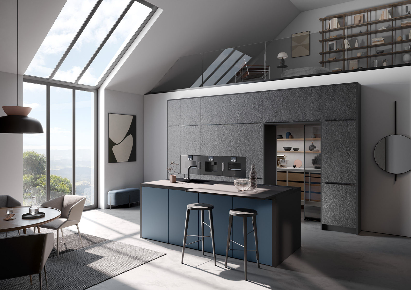
It’s often the subtle differences in texture that make all the difference. Imagine a matte lacquered front in smoky blue—right next to it, a textured wood front in light oak. One surface feels smooth and velvety; the other, warm and vibrant. This interplay of color and texture adds depth to the design—both visually and to the touch.
Or consider an open shelf made of black metal that stands out against a petrol-blue back panel. The interplay of materials, colors, and light makes your kitchen unique—and lends it a cozy sophistication.
A Systematic Approach to Color Variety—Using the NCS Spectrum
If you don’t want to compromise, the kitchen manufacturer’s NCS color system offers you unlimited freedom: Would you like the exact shade of gray that perfectly matches your tiles? Or a warm moss green that complements your living room wall? No problem—all colors can be customized to your exact specifications, down to the millimeter. Designing your kitchen with color has never been easier.
Whether you choose sunny yellow, soothing blue, or natural terracotta—with colorful kitchen cabinet fronts, sophisticated material combinations, and a sense of harmony, you’ll create a kitchen that inspires. A kitchen that’s not only functional but also conveys a true sense of lifestyle. And best of all: it’s as unique as you are.

Practical Tips for Choosing Colors in the Kitchen
A colorful kitchen is inspiring—if it’s well-planned. That’s because colors don’t just evoke emotions; they also influence our perception of space, light, and function. To ensure your colorful kitchen doesn’t turn into a chaotic experiment with color but instead becomes a stylish, inviting space, there are a few things you should keep in mind.
A Systematic Approach to Choosing Colors – How Colors Work
Before you reach for the color chart, it’s worth taking a look at the layout of the room. Is your kitchen on the small side and does it get little natural light? If so, light, cheerful colors like pastel yellow, mint, or soft gray can create a sense of spaciousness and freshness. In large, open kitchens, on the other hand, you can go for something a bit bolder—a deep teal, a rich curry, or even a berry-toned violet.
Tip: Choose one main color and no more than two complementary accent shades. This way, your kitchen will be colorful yet harmonious.
Color Balance Instead of Color Chaos
A well-thought-out color scheme creates a sense of calm—even in a lively, colorful kitchen. Make sure that the wall color, furniture, cabinet fronts, countertops, and flooring complement each other well. Combinations of warm and neutral tones or contrasting color temperatures—such as warm terracotta paired with cool gray—create a particularly harmonious effect.
By the way, colors can be balanced not only through shades but also through materials and textures—matte surfaces recede visually, while glossy ones draw the eye.
Light & Color – A Well-Coordinated Team
The effect of colors depends heavily on light. What looks inviting in the showroom may suddenly appear too bright or too dark at home. Be sure, therefore, to check how natural and artificial light in your kitchen affects the color tones.
Well-planned lighting is worth its weight in gold—from general lighting to accent lighting on shelves or under cabinets. You can find more tips in the blog post on kitchen lighting.
Common Mistakes in Kitchen Color Schemes
We come across certain mistakes time and time again—and they’re easy to avoid:
- Too many colors: If you mix too many shades, you’ll quickly lose your design coherence. Better: Choose a clear color palette.
- Lack of connection to the rest of the living space: The kitchen looks more harmonious when its colors complement those of the living or dining area—especially in open-concept layouts.
- Overlooked surfaces: Floors, tiles, handles, and appliances should also complement the color scheme—a white refrigerator against earthy cabinet fronts can quickly look out of place.


Using Color Thoughtfully—Depending on the Area
Not every surface needs paint—and not every color works everywhere. Here are a few examples:
- Cabinetry & Fronts: Ideal for rich colors or elegant matte finishes. If you’re feeling bold, combine colorful fronts with open shelving or handle-less systems.
- Countertops: Subtle colors, such as light gray, beige, or natural stone finishes, are best here to avoid overwhelming the kitchen.
- Walls: Ideal for bold hues that complement the furniture or accessories. Being bold with color often pays off especially well here.
- No wall cabinets? If you opt out of wall cabinets, you’ll have more wall space for bold colors or tiles. To learn how to pull this off in style, read the article “Kitchen Without Wall Cabinets.”
Designing a colorful kitchen means more than just adding a splash of color to the walls. It’s a creative process that redefines the space—visually, functionally, and emotionally. With a well-thought-out color scheme, a little courage, and the right tips, your kitchen will become a colorful oasis of comfort.
Colorful Kitchens in Various Styles: The Right Color for Every Taste

A colorful kitchen isn’t just a matter of color choice, but also of style. Colors can help emphasize the mood and character of your kitchen. Depending on the design style, bold colors or soft tones can be skillfully used to create the right atmosphere. Here, we’ll show you how to use colors to complement various kitchen designs—from a modern look to a charming country style to a retro-inspired vintage design.
Modern Kitchens – Bold Colors and Clean Lines
Modern kitchens are characterized by clean lines and a minimalist design. This is where bold colors really stand out. Dark blue, teal, a bold red, or a deep green can be perfectly combined with clean-lined furniture and glossy surfaces. Colorful kitchen cabinet fronts in glossy lacquer finishes highlight the clean design and add exciting accents.
In modern kitchens, it’s important that the colors don’t appear too overwhelming, but rather enhance the space visually while creating a calm atmosphere. Combine bold colors with neutral tones like gray or white to achieve a balanced overall look.

Retro & Vintage – Colorful Accents in a Classic Design
Retro and vintage kitchens are characterized by a blend of nostalgic shapes and colorful accents. Here, colors can shine in all their intensity: Designing a colorful kitchen means creating exciting contrasts with bold hues like red, turquoise, yellow, or orange.
Combine these bold colors with classic designs to enhance the retro feel—for example, with round handles, Formica surfaces, or retro-inspired appliances. A vintage look is all about bringing things to life! These kitchens are perfect for anyone who wants to combine a touch of nostalgia with modern accents.


Country Style – Soft Colors and Warm Materials
The country style thrives on soft colors and warm materials like wood and ceramic. Pastel shades such as delicate mint, light blue, or soft pink are particularly popular in country-style kitchens and create a warm, inviting atmosphere. Wooden cabinet fronts paired with light colors highlight the rustic charm and turn the kitchen into a cozy gathering place in the home.
Whether as wall paint or colorful kitchen cabinet fronts, soft country-style colors harmonize beautifully with natural wood tones and contribute to a cozy, relaxed ambiance. The colorful country-style kitchen is especially well-suited for people who love the charming blend of tradition and color.
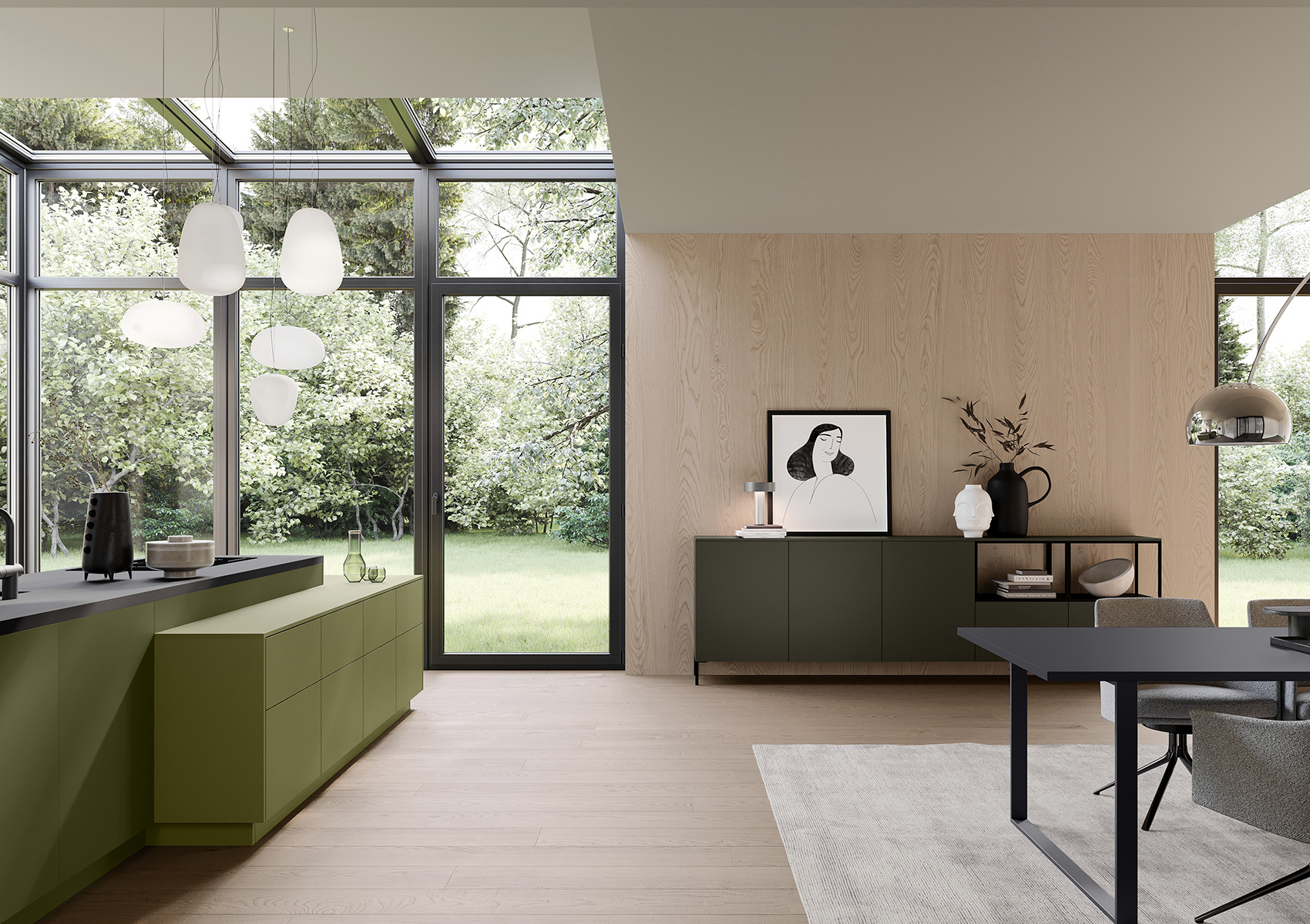
A wide selection of colors and custom design—your custom-made kitchen
The Häcker collection features an impressive selection of colors that give you the freedom to design your kitchen exactly to suit your style. From classic white to soft pastel shades to bold accent colors—the Häcker collection offers a wide variety of colorful kitchen cabinet fronts and versatile designs that you can choose to suit your vision.
You can also design a colorful kitchen and customize it to your liking using the manufacturer’s handy online planning tools. This not only provides inspiration but also lets you plan your dream kitchen conveniently and individually—all from the comfort of your own home!
Whether you opt for a modern kitchen, a country-style kitchen, or a retro design—colors are the key to making your kitchen design vibrant and unique. Take advantage of the wide variety of color options and let the extensive color selection in the Häcker range inspire you to create a colorful kitchen that perfectly matches your style.
Conclusion: A Colorful Kitchen as an Expression of Your Personality
A colorful kitchen is more than just a trend—it’s a way to express your personality and style. With a creative color scheme, you can transform your kitchen into a space that’s not only functional but also full of life and character. Whether you want to design a colorful kitchen or play with multicolored accents—the possibilities are virtually endless.
The colors you choose can lift your spirits, make the room feel more spacious, or create a cozy atmosphere. Any kitchen design—whether modern, country-style, or retro-inspired—can be shown off to its best advantage with the right color choices and combinations. Your colorful kitchen will thus become a real eye-catcher and a place where you feel completely at home.
Take this opportunity to draw inspiration from Häcker’s wide range of kitchen designs and color ideas. And if you’re unsure which colors and combinations best suit your kitchen and lifestyle, it’s worth consulting a professional kitchen designer. With an expert by your side, bringing your dream kitchen to life will not only be easy but also perfectly tailored to your needs and preferences.
Let yourself be enchanted by the variety of colors and design options—your colorful kitchen is waiting for you to design it!
Find a dealer near you now Plan your kitchen online now